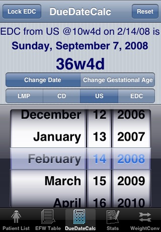
OB Patient Tracker app good for
This application has replaced my previous archaic way of keeping tabs on my pregnant patients
It saves me so much time in my practice
I have shown this to numerous Obg and GP colleagues and feedback is unanimously two thumbs up
Well worth the cost
I used pregtrak on palm software and this is a great app to migrate to on the iPhone.
There are a number of features that are done better than the palm version, such as generating sums for patients due by month etc.
I have requested the developper consider adding a function to calculate the day when a patient will be X weeks. This a function I used frequently to facilitate booking future ultrasounds, glucose screens, followup appts.
I recommend this app to Obs.
I love this application. Its information at the click of a button. It allows me to know how far along a patient is easily, and keeps a record of my numbers of patients each month.
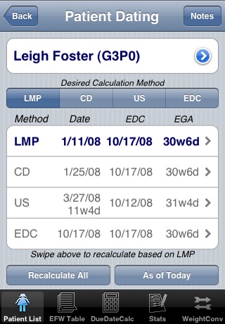
Since shifting from Palm Treo Ive been searching for a program to replace my old PregTrak and this almost does it. The only limit is on the number of ultrasound dates which can be stored (only one can be kept permanently). Hopefully this will be fixed. Quick and easy to add patients and very intuitive. Nice graphics. A great app.
There are two features that I would like to see: Calculation of EDC based on menstrual cycle length (which makes a difference to me) and EGA on a specific date. Otherwise, its a good replacement for PregTrak from my Palm.
I have found this app very useful - great for keeping track of where all your pregnant patients. Saves doing the maths every time you see a pregnant patient. I work as a Family Physician in a small town, so I have a few women to keep track of. My only complaint to far - I cant enter twins as a twin delivery. Still, its a small problem - theres a place for notes like that. I heartily recommend it to anyone with prenatal patients.
Some bad moments
I paid for it and its simply not working after iOS 7!!!
And it wasnt cheap!!! Please find a solution for it!!
Either you fix the "delete option" or give us our money back!! This app wasnt the best, but after iOS 7 its unbearable!!!! :/
Lots of bugs on IOS7. Crashes all the time.
Beyond, a long time without updates.
It was good at first, but now, disappointing
I cant delete old patients!
Its not a cheap app and simply doesnt work!
This app has excellent potential to be a very useful clinical management tool. Unfortunately, its missing some very key components which really should be included in an app at this price point. The developer is very good at getting back to emails immediately, but my feedback was given eight months ago. Since no changes have been made Ive been forced to move to other apps because of the below limitations.
1. No encryption. Im not sure what privacy legislation is like region to region, but where I am patient information MUST be encrypted. The four-digit password on the iphone itself isnt enough. Because of this, Ive had to switch to using an encrypted notebook program (1/5th the price of this app) to store patient data.
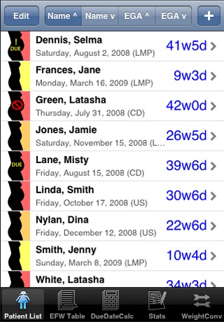
2. There is no way to mark a patient as having been delivered. So if Im following her in the post-partum for pregnancy-related complications, the app marks her as still being due, or as being seriously overdue. I soon get a list of overdue (yet delivered) women that clog the screen in front of the people who are actually due.
3. The notes does not expand or scroll as they fill the screen. In other words, if you get enough notes to fill to the keyboard (about 2/3 of the screen) then youre typing blind after that because the typing goes below the keypad. This soon renders the notes function useless.
Thats the basic stuff that needs to be fixed for the app to be functional as-is. Now, for it to be outstanding (and then, worth the current pricetag)...
- consider adding a to-do section to each patient. So if youve booked a consult for a woman and need to follow up on it, you could, under that patient, click some kind of to do button and fill in the consult and date you want to follow up. Then that data would show up both in the notes for that patient and in a tasks section of the app. You could have a push functionality to remind you of tasks.
- Some quick visuals would be handy: for example, having a checkbox for GBS positive or negative, primip or multip, rh pos or neg, drug allergies, etc. Those could appear in the main summary page next to the names.
Again, this could be such an incredibly useful app, and the developer has a great start here. Unfortunately, its little better than a notepad that stores patients by due date. Without the encryption, its unusable, and unfortunately far from worth the $14.99 price tag.
PLEASE UPDATE, at least to fix the bugs that have been there for over FOUR (4) years now... we are not getting now what we have paid for 4 years ago... LAST UPDATE IN OCTOBER 2008... Come on...
Since the 4.02 iOS update, all the dates appear as 40w... instead of 40w3d like it used to before. the only one that do not do it are the weeks below 10 weeks... it makes it annoying to have to click on every patients name to be able to see the exact timing for the follow up...
With iOS 7, it is now impossible to erase a name without the app crashing down...
I use the program with an iPhone 4, will try it on the 5s as soon as I get a hand on it...
Also, I sent comments to the developer over a year ago. He was very quick to answer, telling me that lots of improvements were still ti come, but the last update is more than 4 1/2 years old... It is sad because it is an app that use everyday in my practice!
Needs incryption, SBG status, rh +-, retina display support ( to fix the weeks with iPhone 4 and + issue), multiple ultrasound support, delivery date, lists for collegues (when covering for one)
Will give it 5 stars then...
